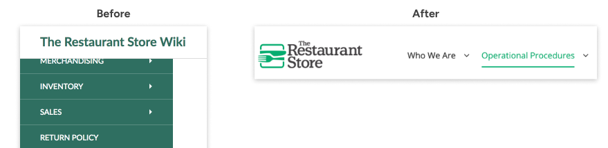
Knowledge Base

A collaborative hub for The Restaurant Store’s home office and 10+ locations to connect, share knowledge, and learn together

Problem

The Restaurant Store’s product pages used outdated UX patterns and styling. Shopping flows and layouts didn’t follow familiar e-commerce conventions, and important features—such as delivery options—were hidden, often making for a stalled or frustrating shopping experience.

Solution

I updated both the UI and user flows on the product pages to improve the shopping experience, increase the visibility of important features, and align with the recent brand update. I also dedicated extra attention to refining small but meaningful interactions and UI components to help customers make faster, more informed decisions and feel more confident throughout the checkout experience.

Goals

Over a four-month timeline, I collaborated with software engineers and the marketing director. After informally gathering feedback from managers and retail employees about their vision for a wiki that could scale with growth, the marketing director and I defined the project goals.
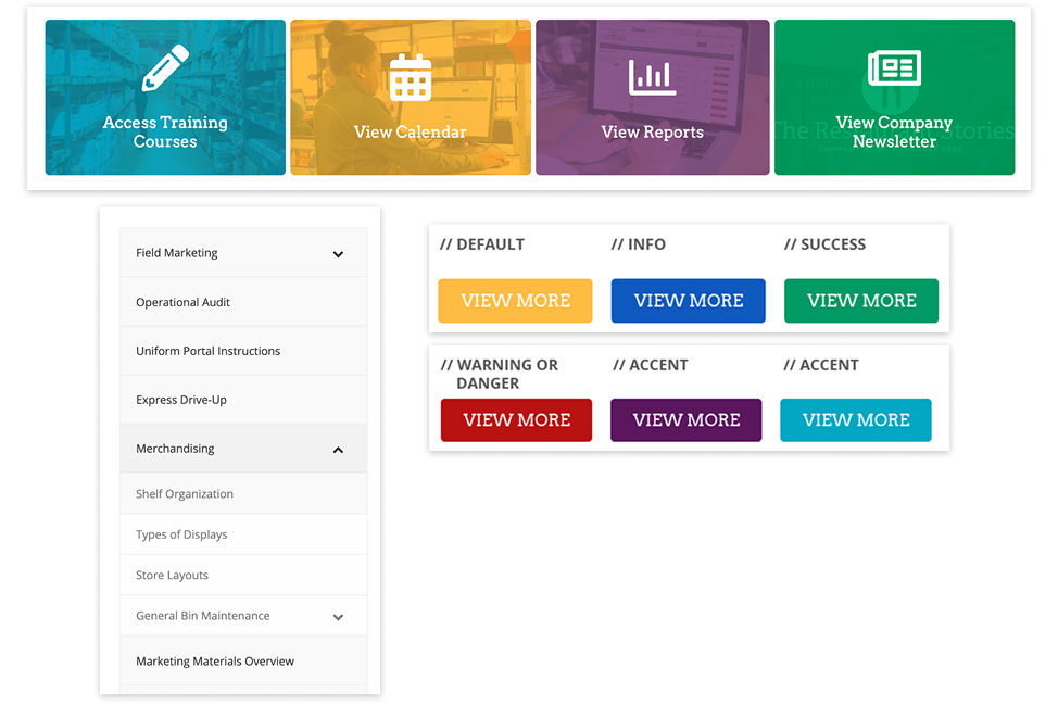
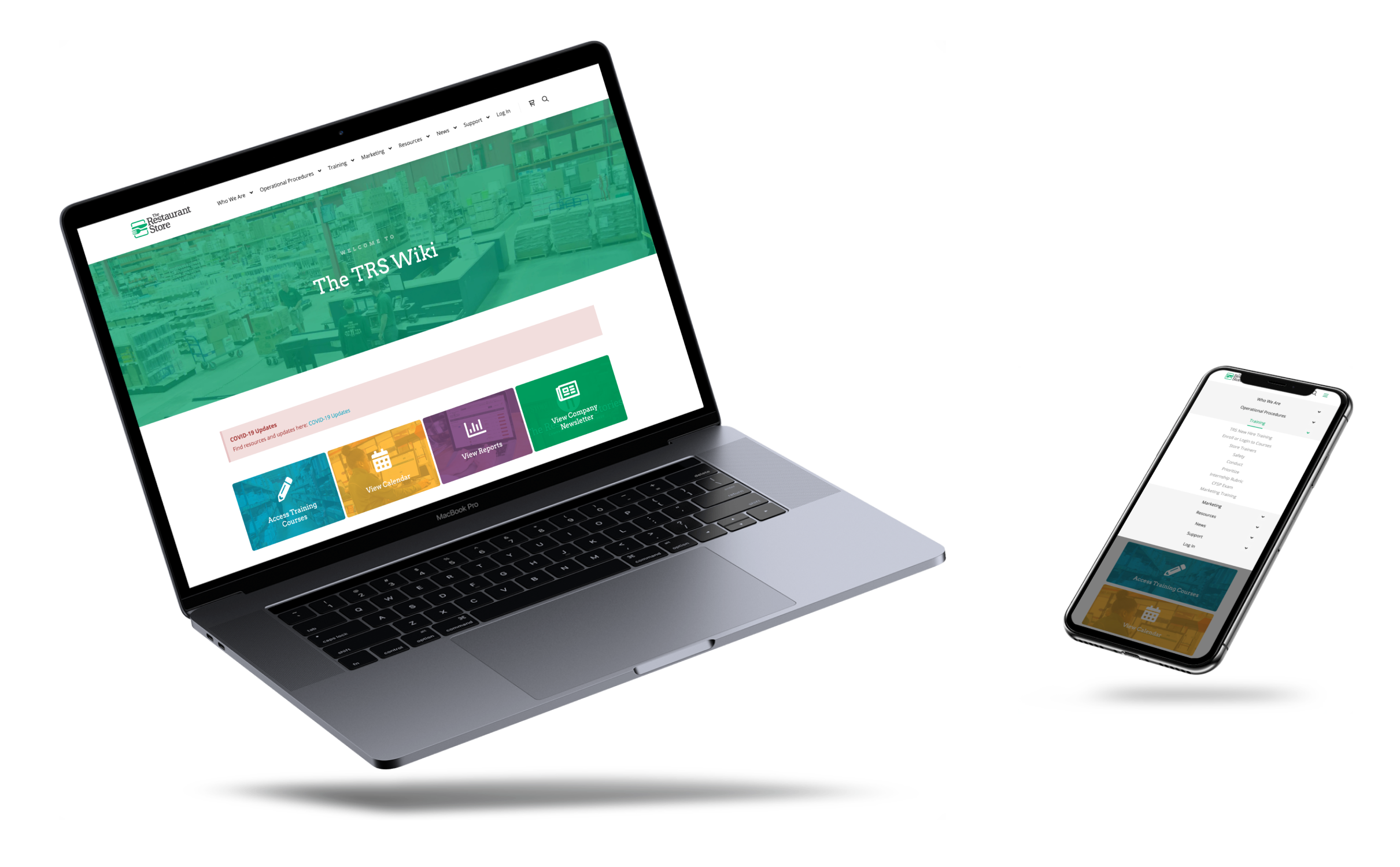
Optimize design for mobile users
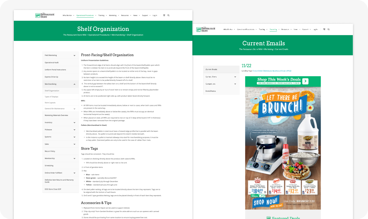
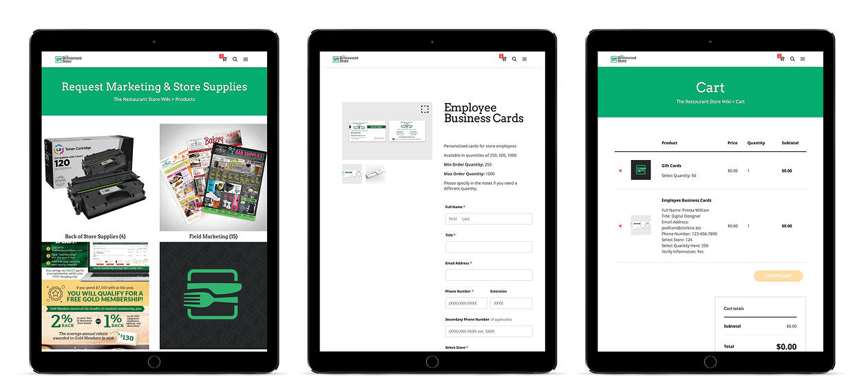
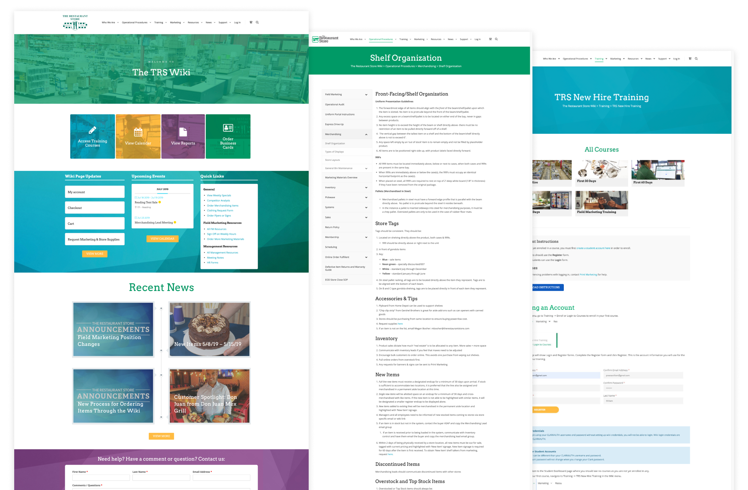
Standardize the operational procedures
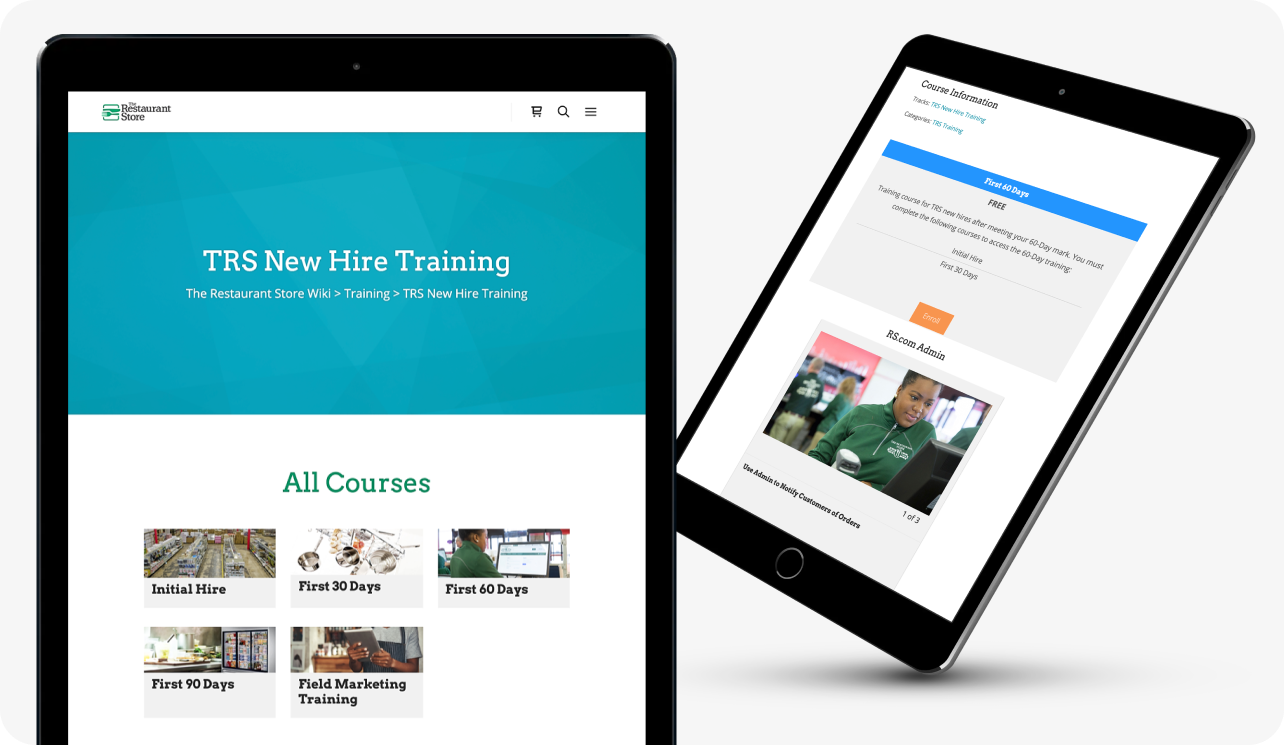
Implement onboarding training courses
Implement a system for merchandising replenishment

Wayfinding

I used tree testing and surveys to inform the site’s information architecture. Through focused testing groups, we identified several navigation pain points:
  • Topics were poorly organized, making information difficult to find.
  • Flyout menus created frustrating usability, particularly on mobile.
To address these issues, I condensed the menu into seven broad topics within a sticky, horizontal header. All other content was reorganized into subtopics with landing pages for more specialized areas. By presenting fewer options at a time, users can more easily find the content they need.

Discoverability

The main content consisted of operational procedures, so the site required a layout that could accommodate long, content-heavy pages. Therefore, I focused on creating a blog- and documentation-style UI. To make the site easier for on-the-go employees, I implemented large, colorful buttons and expanded sidebar menus for better mobile interaction. I also updated typography to align with our brand and defined headings, body text, and link styles using customized CSS.
Operational Procedures
The entire operational procedures manual is accessible on the site through intuitive navigation. Broad global topics funnel into specific subtopics, and submenus ensure users never feel lost.

One Stop Shop

An e-commerce platform built with WooCommerce streamlined the request and shipping process for retail marketing materials, including flyers, uniforms, business cards, and more.

Learning Management System

By implementing a learning management system, we ensured that all new hires received consistent training across locations. Optimized for mobile, the site allows employees to complete training while moving around the store, creating a more interactive experience with the products.

Connection

A company blog features employee spotlights, company updates, and articles written by in-house marketing staff, helping employees across all locations feel connected to the home office.