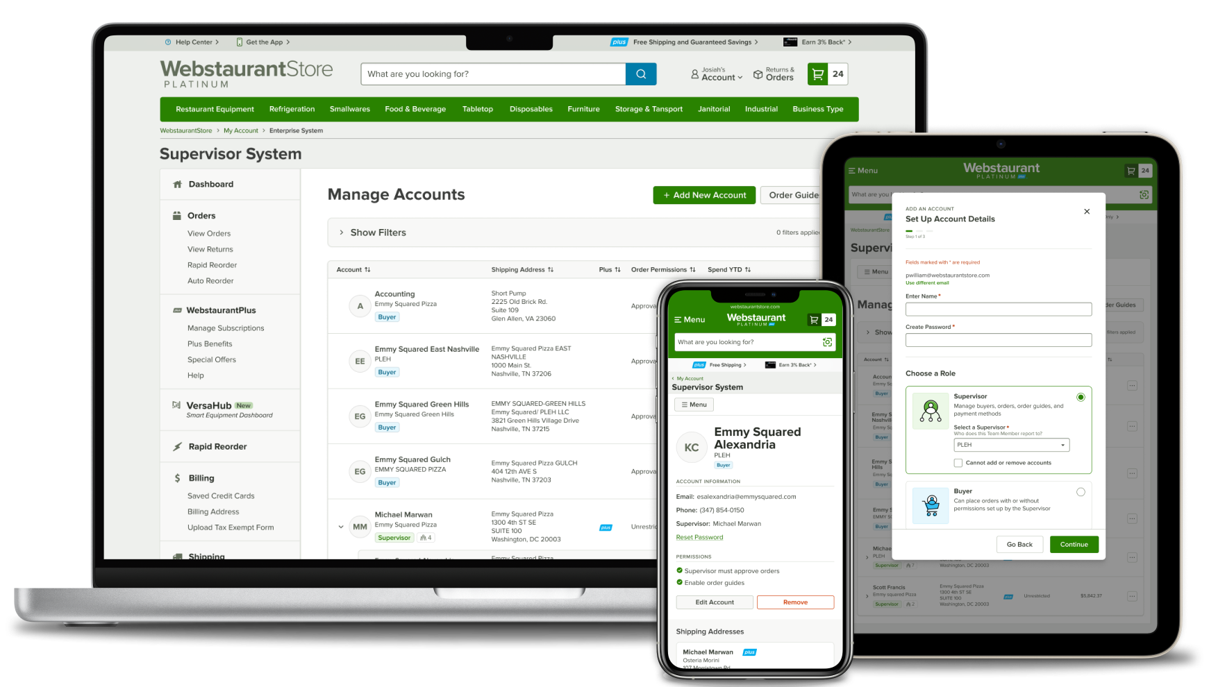
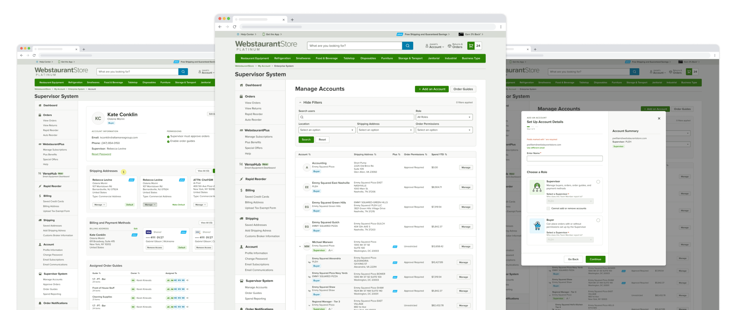
Supervisor System

A collaborative space for Webstaurant Store’s enterprise customers to manage their orders, spending, and teams

Problem

The Supervisor System enabled customers with multiple businesses or locations to manage orders and spending, but customer feedback revealed that it no longer supported the complexity of growing teams, purchasing workflows, or compliance needs.

Solution

In response, my teammate Kate Renda and I led a full system rewrite, introducing enterprise-level features such as hierarchical team structures, shared assets, spending controls, and clearly defined roles and permissions—all delivered within a scalable, intuitive interface.

Goals

Over a four-month timeline, I collaborated with software engineers and the marketing director. After informally gathering feedback from managers and retail employees about their vision for a wiki that could scale with growth, the marketing director and I defined the project goals.
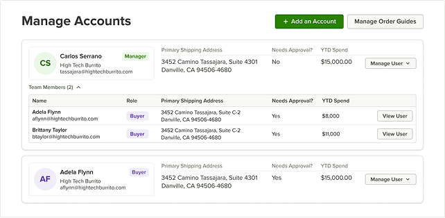
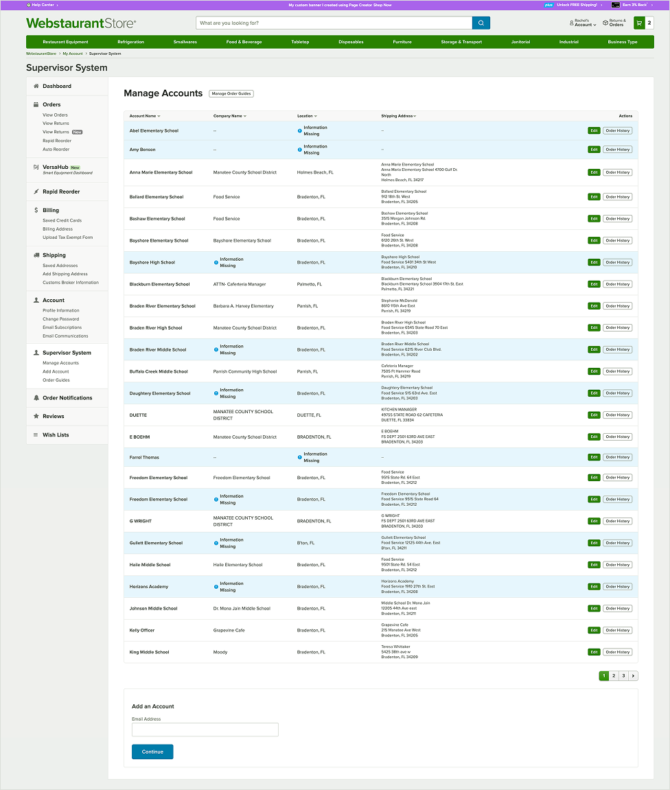
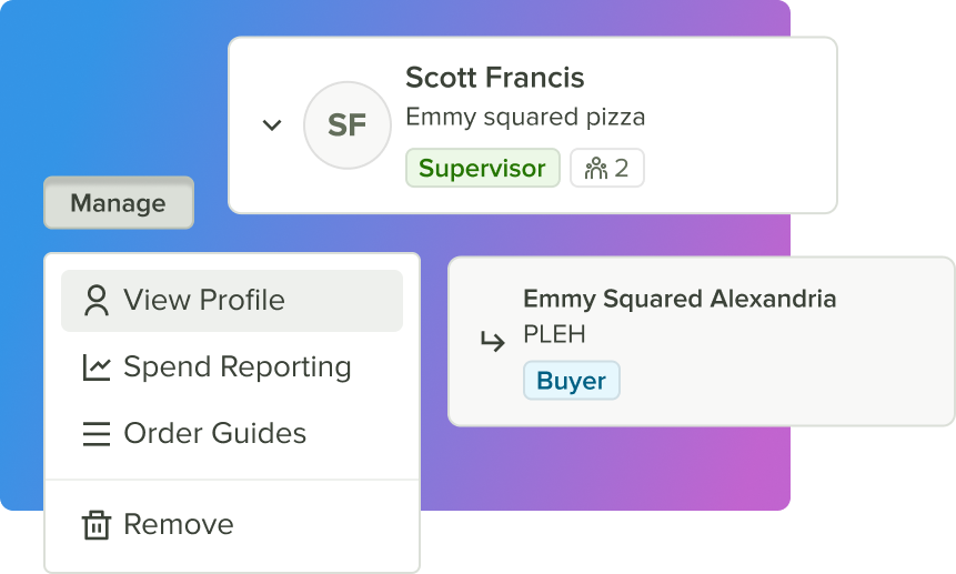
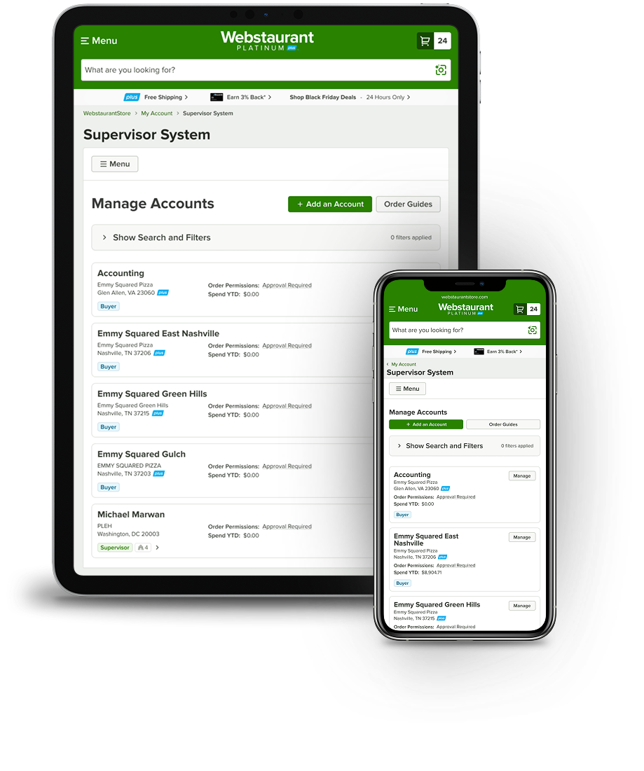
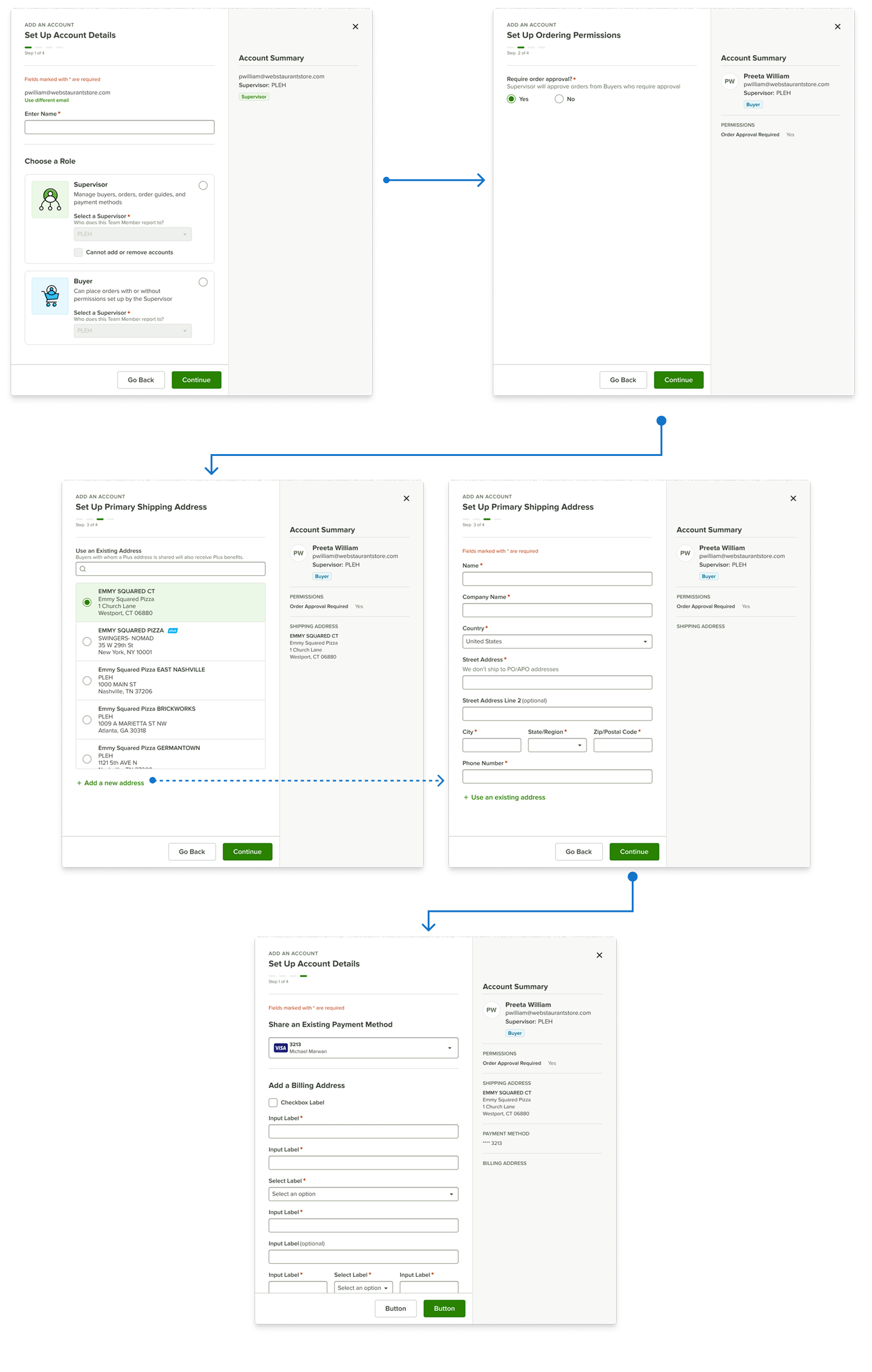
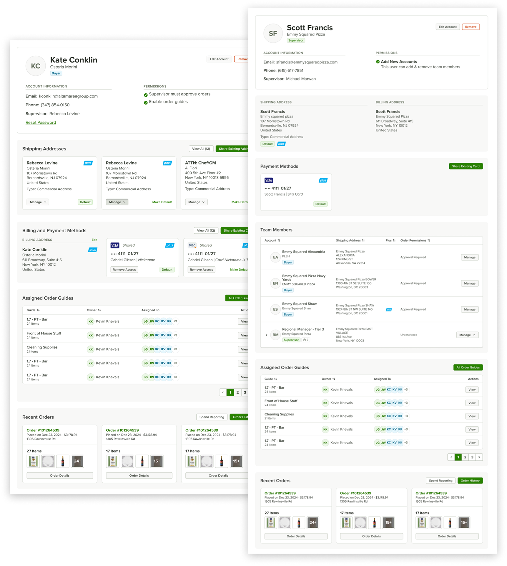
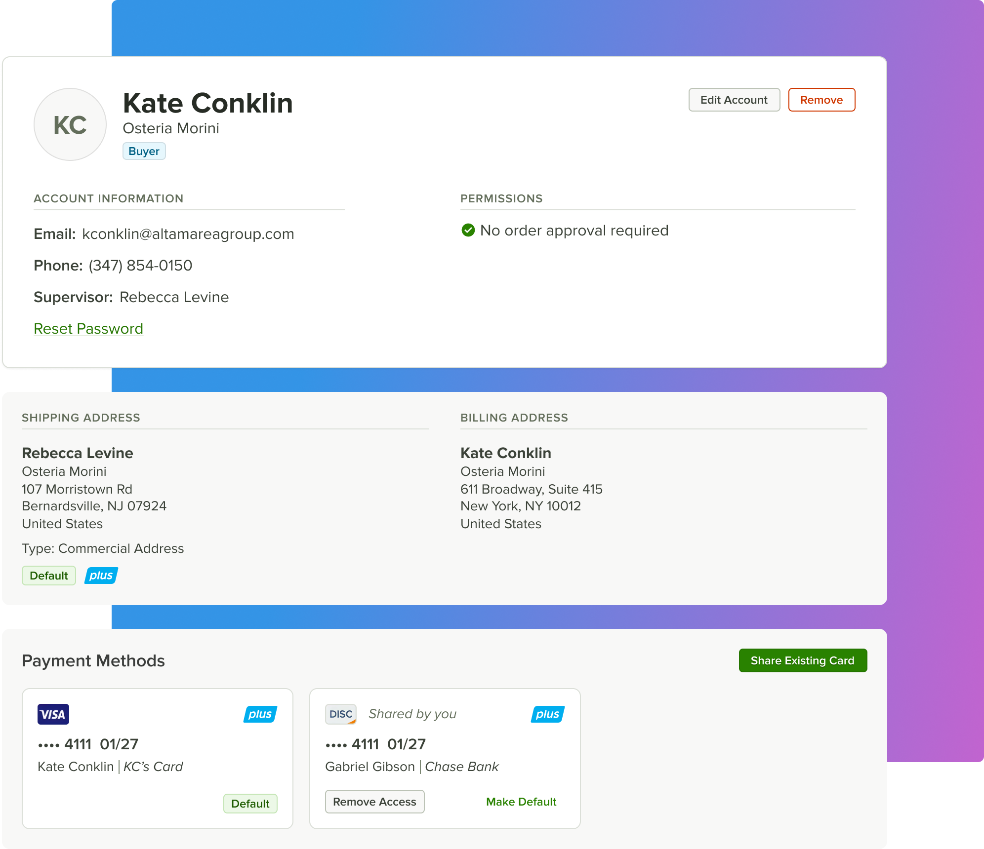
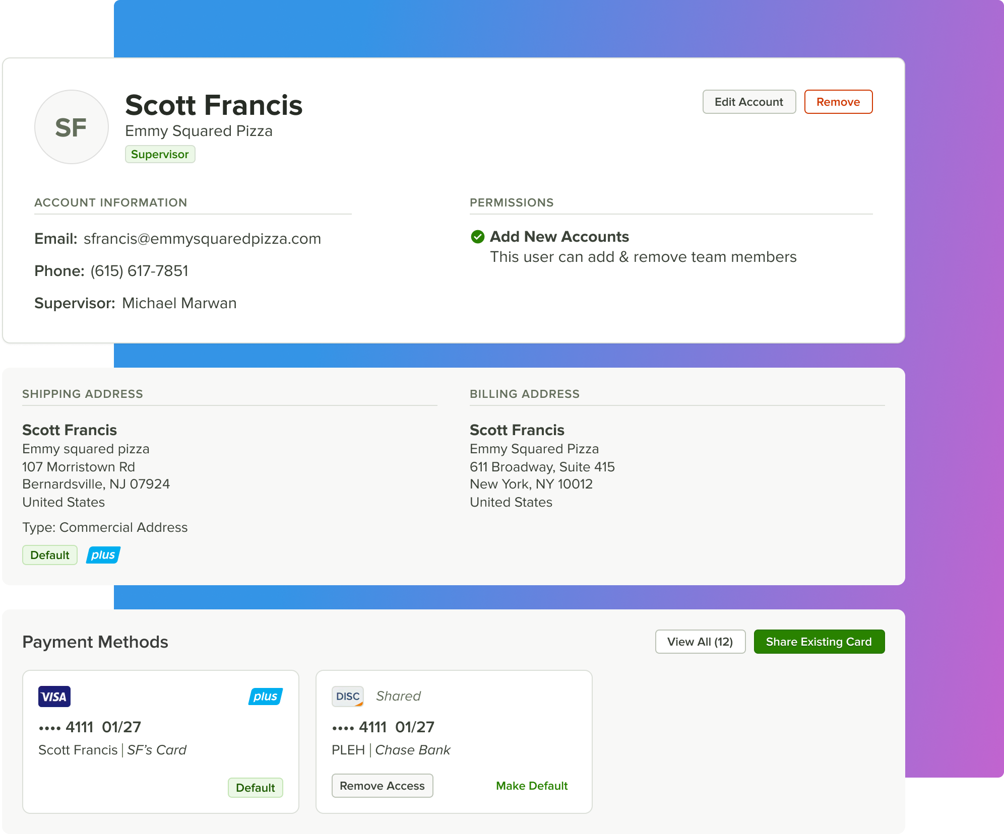
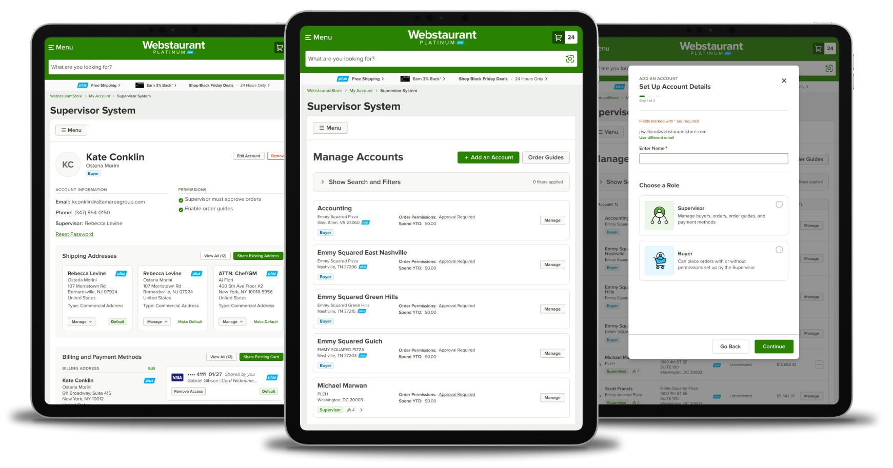
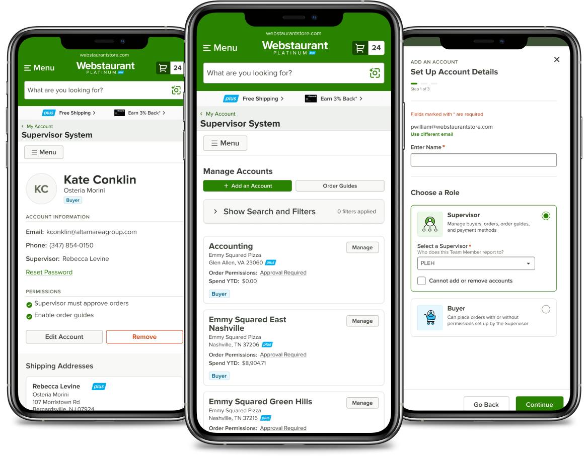
Create a tiered structure to support multiple teams within an enterprise
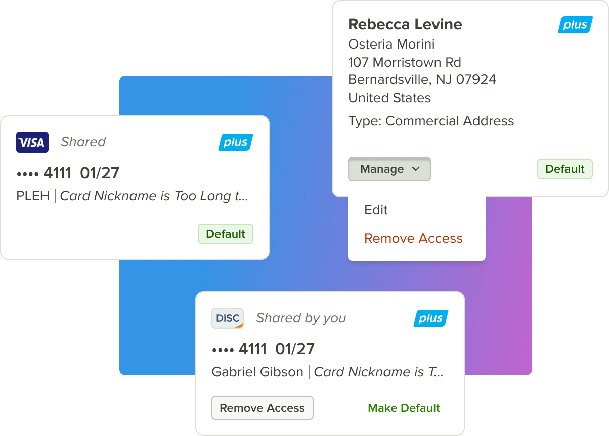
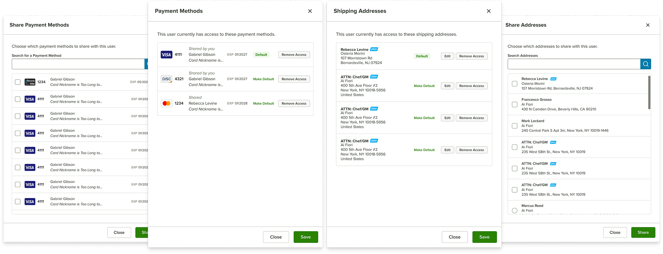
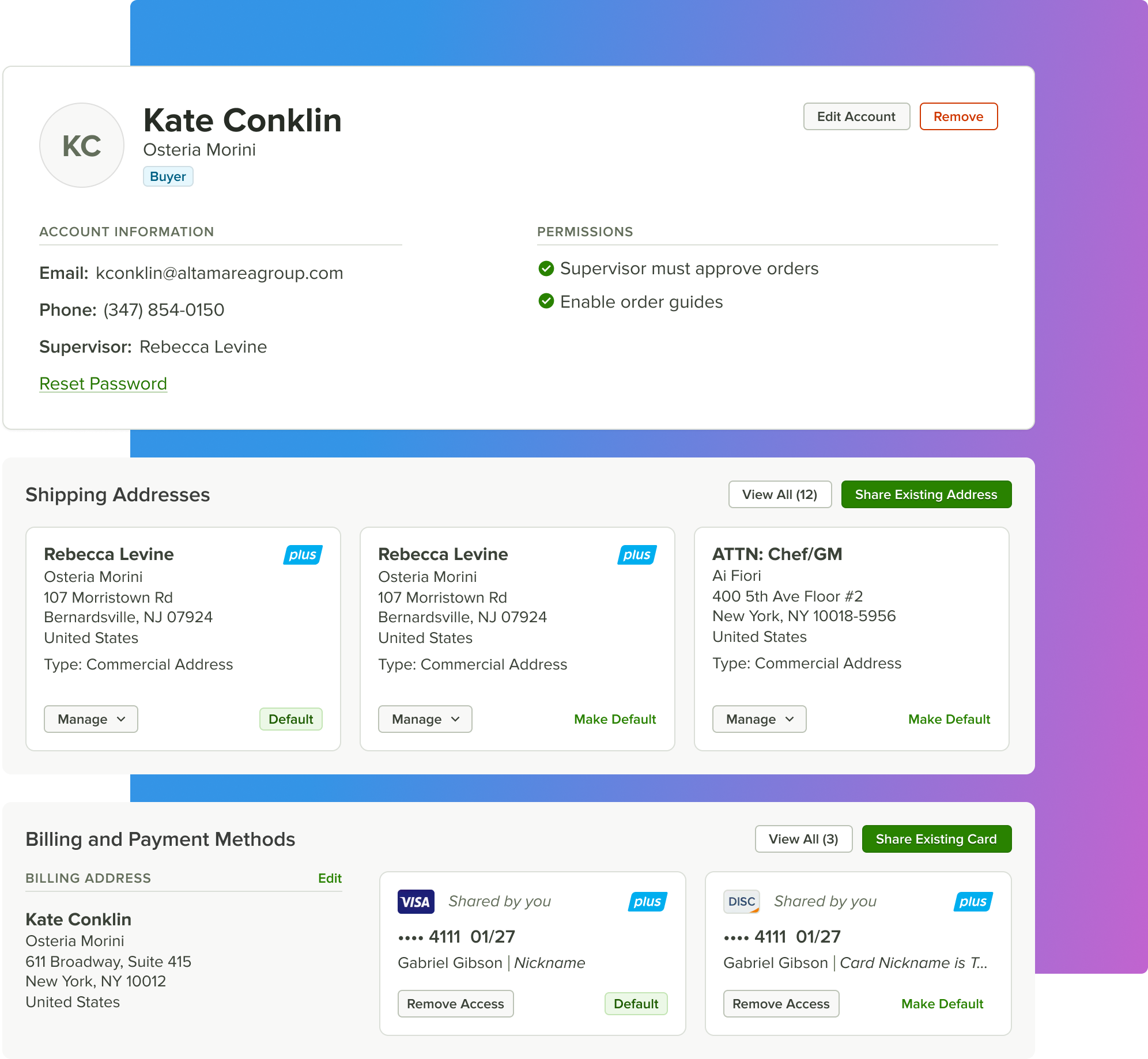
Support shared assets, including addresses, payment methods, and membership subscriptions
Refresh the existing UI to support new, complex interactions and features

Simple Experience, Complex UI

The core challenge was turning complex, data-heavy UX into a simple, intuitive UI for non-technical users. I designed compact, modular visual elements that could display interactive data clearly without overwhelming the interface.
Managing Multi-Level Accounts
The primary challenge was displaying up to five levels of teams—along with roles, permissions, locations, and spend data—within a single view.

I explored card-based layouts to fit large amounts of information into a constrained space. This approach was a MISTAKE. It reduced scannability and hid key information. Important metrics and actions were difficult to find, especially for time-constrained business users.
Tiers Without Turmoil
The most effective solution was also the simplest: a structured data table. Business users were already familiar with this pattern, making it easier to scan, compare, and act quickly. I layered in subtle, repeatable UI elements to support hierarchy without requiring onboarding.
Before
After
Designing for Scanability
The interface evolved into a clean, data-first experience optimized for fast comprehension.
  • Badges and avatars improved visual scanning
  • Expandable rows revealed nested teams
  • Clear directional indicators guided navigation across tiers
  • A single “Manage” action kept workflows simple and consistent
Mobile Strategy
Since mobile usage was limited, the experience prioritized desktop. For smaller screens, I adapted table content into card layouts that preserved data hierarchy while remaining readable and usable.
Flexible Account Setup
Introducing custom roles and permissions made account creation more complex and non-linear. I designed an “Add Account” modal that adapts based on user type and permissions, guiding users step by step through account creation or assignment.
Before
After
Reducing Cognitive Load
The flow emphasized clarity and simplicity:
  • Minimal decision points
  • Clear selection patterns
  • Straightforward form inputs
  • A final account summary to confirm setup
This ensured backend complexity never surfaced in the user's experience.
Modal Flow
Role-Based Profiles
Before
Existing user profiles provided little value and lacked actionable information.I redesigned profiles as role-aware dashboards, surfacing relevant data such as team assignments, order guides, recent activity, and shared assets.
After
Shared Assets, Clearly Managed
Profiles became the central place to manage shared assets like addresses and payment methods. Actions were intentionally streamlined to reduce friction and encourage adoption.
Clear Permission States
Different user roles required different levels of access, and it needed to be immediately clear what actions were available. Views and actions dynamically changed based on role, ensuring users only saw what they could interact with.
Restricted Buyer
  • Needs approval to place orders
  • Cannot add their own shipping addresses or payment methods
  • Supervisor can share, add new, edit, and delete addresses and payment methods
Unrestricted Buyer
  • Does not need approval to place orders
  • Can add their own shipping addresses and payment methods
  • Supervisor cannot add, edit, and delete shared addresses
  • Supervisor can share, add, edit, and delete payment methods only
Supervisor
  • May or may not add new accounts
  • Does not need approval to place orders
  • Can add their own shipping addresses or payment methods
  • Supervisor can share, add, edit, and delete payment methods only

Responsive By Design

User interviews showed that most customers used the system on desktop. I prioritized the desktop experience, carefully choosing which information and actions to surface and which to hide on mobile, ensuring the design scaled cleanly across devices.
Overcoming Mistakes
Early UI decisions slowed progress, including skipping wireframes and using cards where tables were more appropriate. These setbacks reinforced the importance of evidence-based design and aligning solutions with user expectations—even when challenging initial direction.
Applying these lessons, I partnered closely with development and stakeholders to iterate and release the MVP in phases. This approach reduced ambiguity, improved cross-functional collaboration, and kept the project moving forward on a realistic timeline.